Exploring Your Data, a Beginner's 101
Exploratory analysis for non-analysts
What happens after you’ve got your data?
After having taught over 400 people data storytelling, we have come to learn that the greatest hurdle in data storytelling is not skills-based, but an emotional one.
For those who come from a humanities-based or arts education, data is highly intimidating. They search for easy-to-understand frameworks and tools as a guide to absolve their imposter syndrome, in the hope that it will put them on the path of accuracy and correctness with their data analysis. On the flipside, those from a science or mathematics education struggle to find the emotional tone and narrative shaping with their data insights. In both instances, the fear comes from a place of worry that they might step into a puddle of wrongness.
The steps here are for everyone to get started on their data in the simplest way possible and find our bearings. While these steps are written to open up files that are not excessively large for Excel or Google Spreadsheets, they also make sense for Python or R for those more comfortable with coding.
Easily one of the most underrated steps in data analysis and storytelling is simply to sort your data.
When you’ve opened your spreadsheet, simply sort your fields by ascending or descending order, depending on the query you have. This principle applies to creating data visualizations and charts, too. A chart sorted in ascending or descending order makes a huge difference in helping your reader find your insight right away.
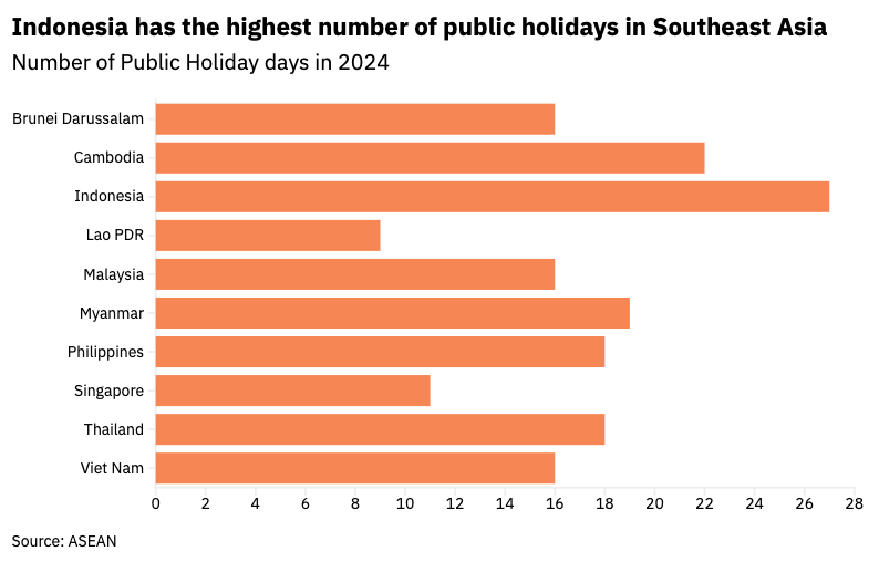
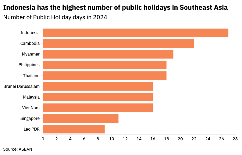
If your data is meant to be read in a specific order of sequence, sorting your data with an index also ensures you always have a good overview and bearing of the total information you are supposed to have.
In every statistics lesson around the world, lecturers, professors, and teachers alike start with the classic, minimum, median, maximum. This is a way to understand the center and the spread of the data you’re working with. What do the middle parts look like and the extreme ends look like?
For some, this may feel like basic mathematics and even a little dull and boring, but these are essential steps that can reveal a lot of information on the shape of your dataset. Starting with the center of your data, these can vary between the median, mode, and average. They are all ways of understanding the middle, but differ in what it measures.
Averages are most common, but they are sensitive to extremes and outliers, which would paint a different picture of your dataset. Median, on the other hand, is the number in the middle of the dataset if arranged from smallest to largest. These matter if you’re looking for inequalities or uneven distributions. For example, in measuring the income distribution of a country, a handful of billionaires can pull up the average significantly.
.png)
Looking at minimum and maximum values also immediately informs you of the range of the dataset you are working with. This is helpful in understanding the scale of difference or change with your data. For those who work with data regularly, range is often the first go to to check against outliers, any potential data entry errors, and so on.
There’s a reason why pivot tables (more on that later) or summary codes in Python and R focus on providing topline numbers on centers and spread of the fields of your dataset.
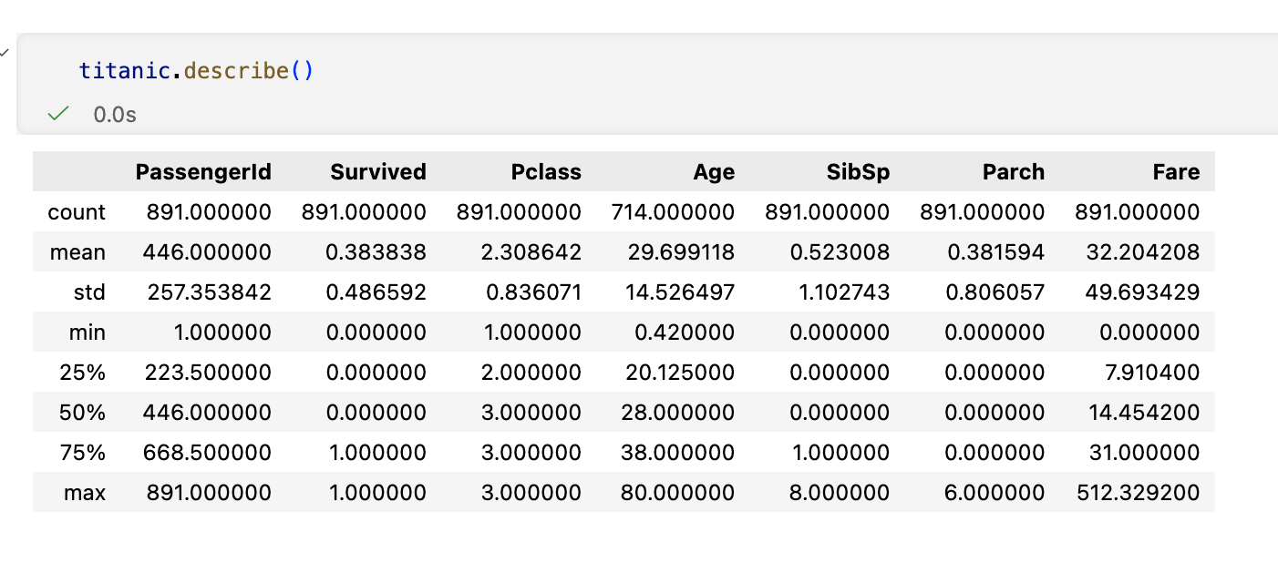
It’s a helpful way to bring out the obvious tells, whether there are duplicated rows, wrong units, or a grand total that's suspiciously round, large, or overly small. Once, when we were working on a dataset about trees in Singapore, we noted that the range indicated there were trees over a few thousand years old. While that’s possible, it didn’t agree with our understanding of Singapore’s natural environment, given the country’s young age. As it turns out, it was a data entry error as the year it was planted was recorded as its age instead. More on this on #6.
That said, the most common inconsistencies in your dataset are always surprisingly minor but have an impact on your findings. They can be countries spelled five different ways (i.e. Republic of Korea versus South Korea, Laos versus Lao PDR), an extra spacing following a number, a missing letter somewhere, an incomplete entry or sentence and so on.
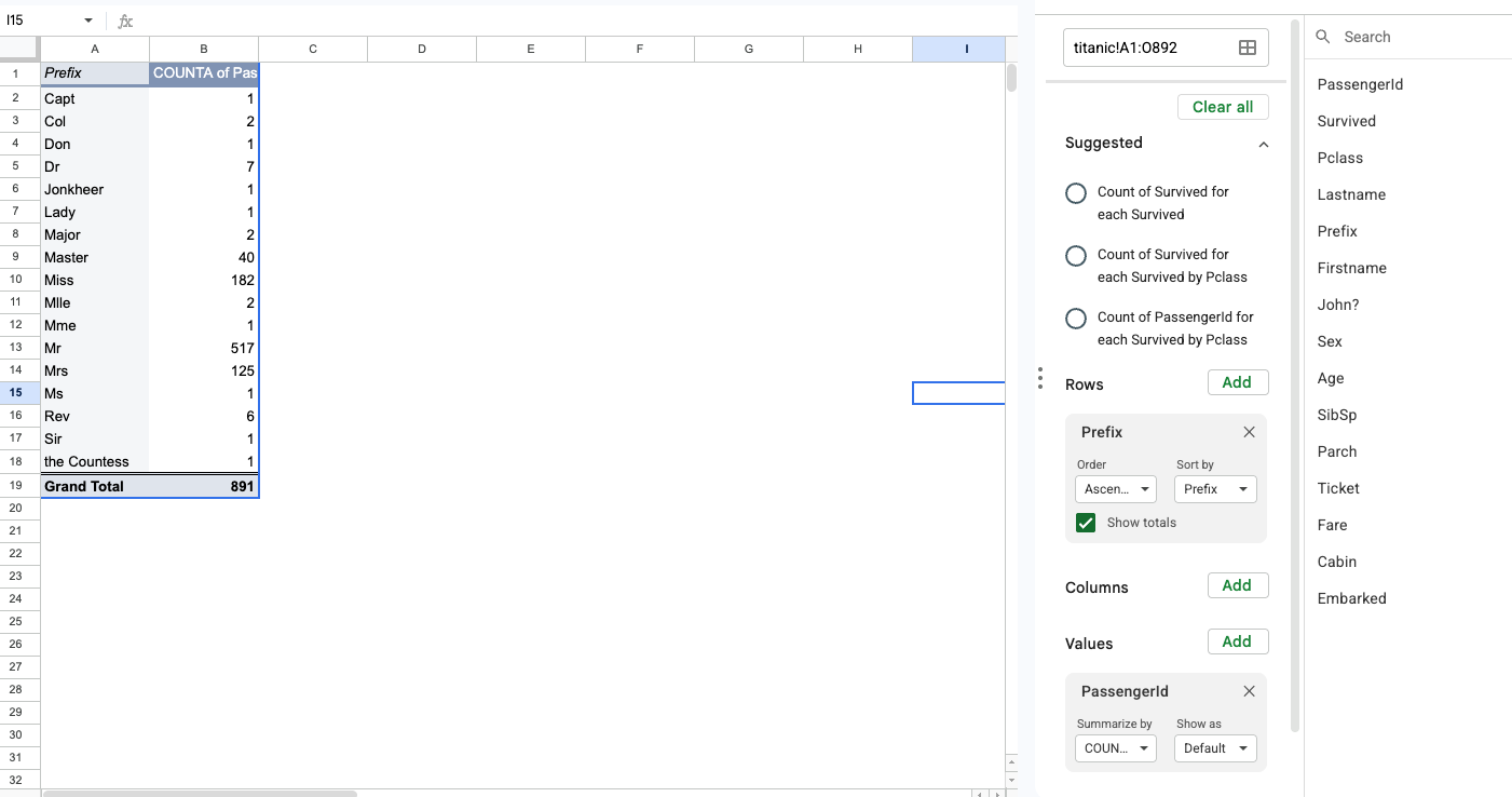
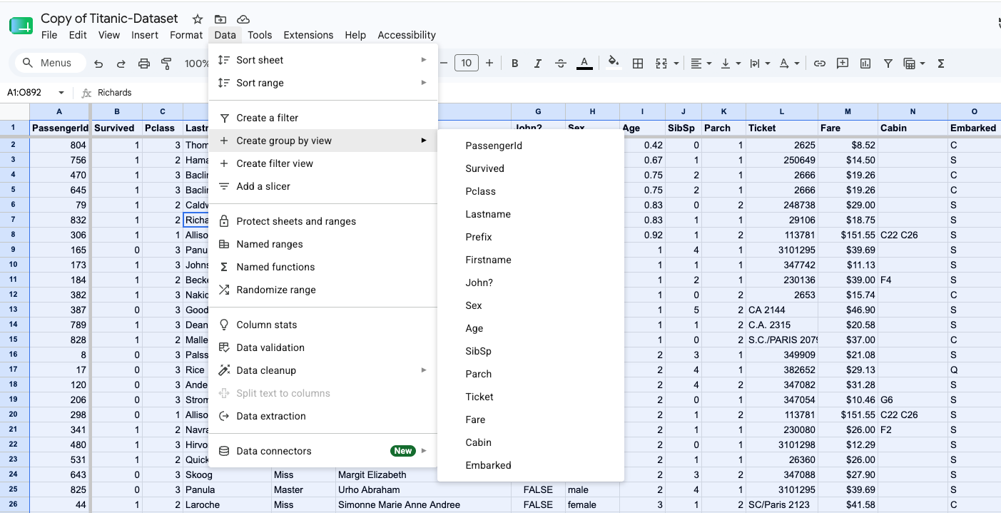
While pivot tables are incredibly useful for counting sums, averages and counts, my personal favourite use of them is to find irregularities in qualitative inconsistencies. For example, spelling variations of a name, acronym, or even a sneaky extra spacing in a phrase that can lead to further confusion down the road. These will show up in a pivot table as separate entries, providing an opportunity to clean and rectify them easily.
In the screenshot above, one can easily see that there are various prefixes to describe individuals with no clear indication on what they represent (i.e. Miss vs Ms). This immediately tells me there’s a potential story here in what leads to different prefixes, or some further categorisations have to be done.
Filtering, the opposite of summarising, isolates your data into slices so you can narrow your queries better. Say you have country-wide data, but you only want city-specific information, filtering becomes a quick and easy tool for you to narrow your search.
Filtering is an essential step in helping you to find a shape of story that is well known as starting big, and drilling down. Topline numbers can obscure substories within the larger dataset or narrative. This is where we may find patterns that go against the grain; a city that has a unique trajectory, a demographic group with different behaviours, and so on.
# 6 – Trust your gut
A piece of advice we repeat at every data storytelling workshop we conduct is to trust your gut. Intuition sometimes is your best instrument in data analysis.
Even though data analysis is often touted as a science, our lived experiences are just as valuable. This is how we knew that the numbers on the age of trees were wrong in #2.
In another example, in a story we worked on at Kontinentalist about s in Southeast Asia. If taken at face value, we would have walked away from that dataset with the assumption that sex trafficking is not as big an issue in the region. Our assumptions and gut told us that felt wrong, and we took a different approach altogether, aggregating news headlines rather than rely on someone else’s dataset.
While these six steps will definitely help you find your footing with data exploration, you might end up with more insights than you asked for at the end of it. Excited by what you’ve discovered and found, your temptation is to put it all into your story or report. Well, don’t.
Your starting query is there to ensure you are disciplined in the question you are trying to answer. Everything else in your data cleaning or discovery process outside of your question is either supporting evidence or detractors from your story. Read this:
These steps guiding your data exploration is to provide a good foundation for your findings to be on the right track. That said, they are guard rails, not bulletproof vests. Knowing the shape and spread of your data ensures that’s a solid reference point for you to return as you go further down your rabbit holes. For those still worried about landing in a place of inaccuracies, this is a safe anchor. It also helps ensure that findings aren’t reduced to singular digits, and the human elements of a data exploration is retained.
Now that you’ve found your numbers and insights, we will move on to what makes it stick – a narrative journey. In our next article, we’ll cover the shape of stories and how to pick the right one.
A habit worth building is to take the minimum and maximum rows you found back in #2 and filter straight to them. The extremes are where both your data-entry errors and your most interesting cases tend to live. Or even consider breaking down your dataset into further groups, and recalculating the mean, min and max for each group to find comparative insights.